Colours
Designers can always help improve accessibility by applying different colours to the content. Areas we can pay attention include:
- Text and background colour
- Colour as information
Text colour vs background colour (colour contrast) #
A widely held misunderstanding is that people ask “Is this colour accessible?” However, it would be more appropriate to ask “Is this colour combination accessible?” The reason for this is that accessibility is often measured by the colour contrast between two colours, and it requires the consideration of at least two colours. Simply stating that a black text is “accessible” is not accurate because it may be accessible on a white background, but not on a black background.
Headings #
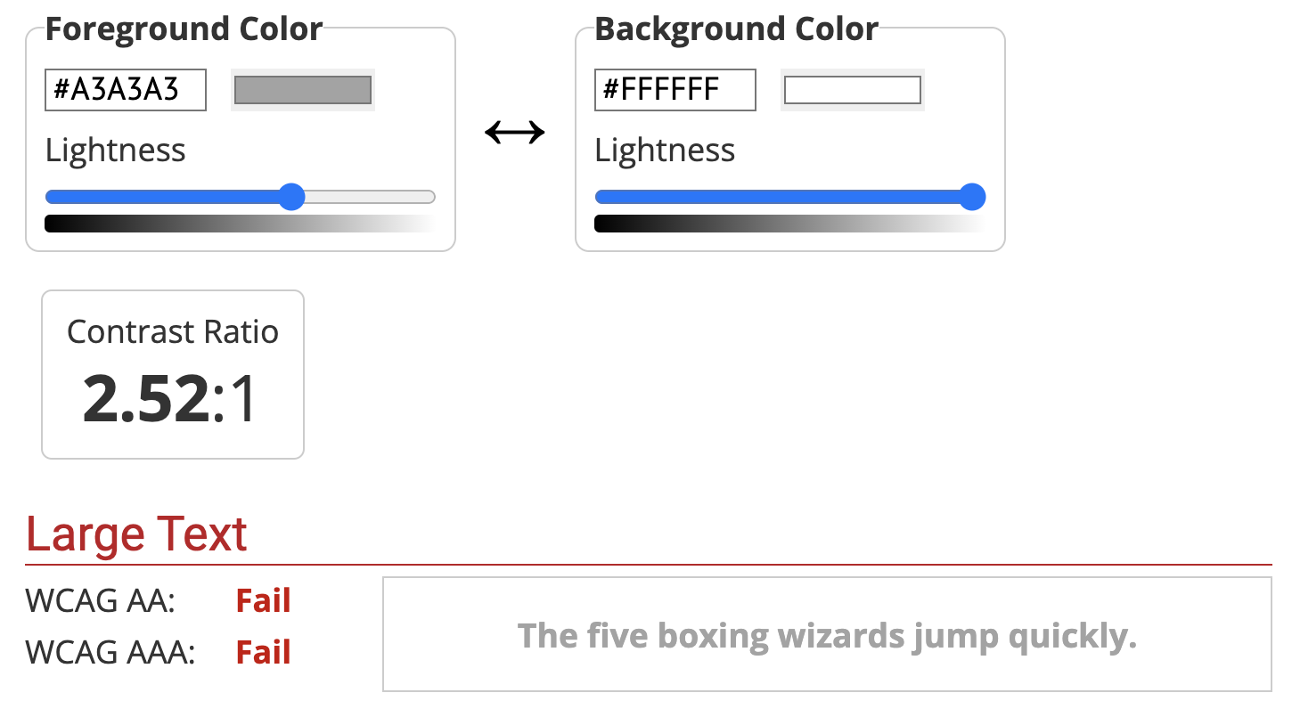
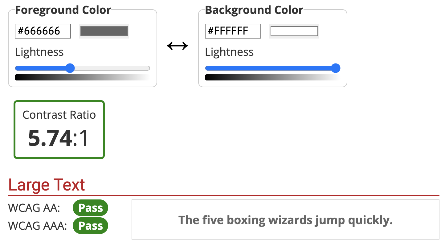
Heading text is typically larger and concise. The minimum colour contrast ratio should be at least 3:1.


Body Text #
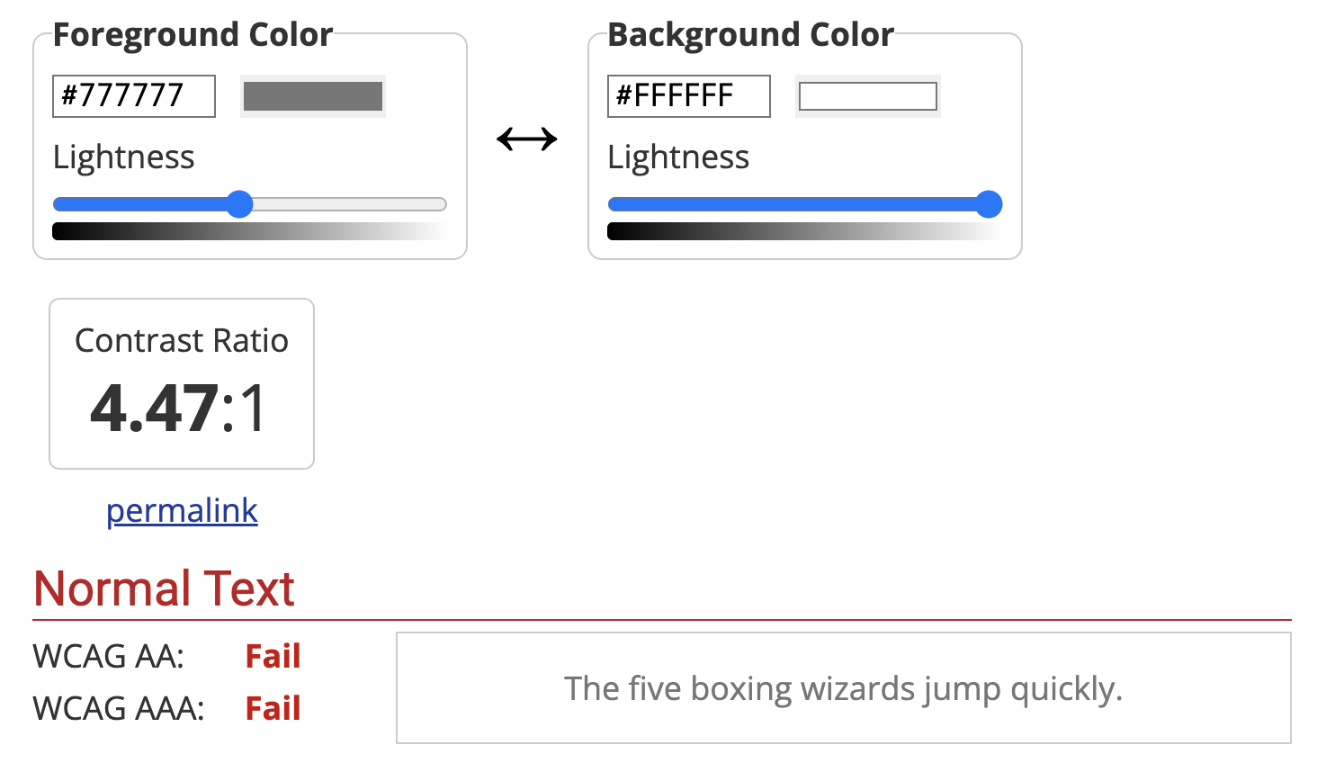
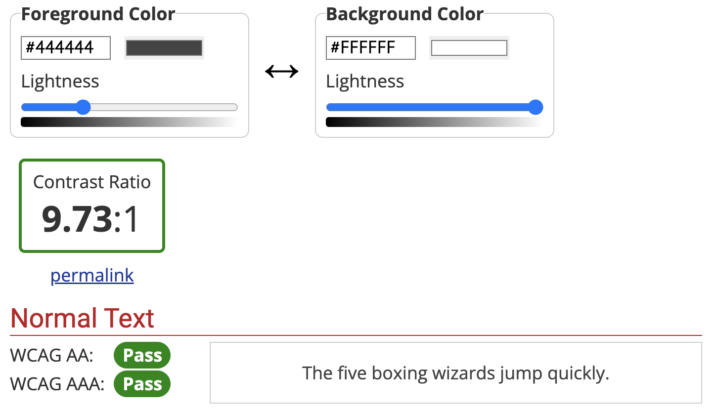
The main content we aim to deliver to our users is referred to as body text. This text is usually longer than heading text and smaller in size. The minimum colour contrast ratio should be 4.5:1 for better readability.
However, it’s important to avoid having too high of a contrast ratio as well. A full black (#000000) text on a full white background (#FFFFFF) has a contrast ratio of 21:1. This can be visually overwhelming for some users.


Text Over Textured Backgrounds #
Placing text over textured or photo backgrounds can present challenges for readability. To improve visibility, it’s recommended to use a solid or darkened background behind the text to increase the colour contrast.
Colour contrast checker #
When testing colour contrast ratio, there are some free online tools for us to choose. The contrast checker from WebAIM is one of the most popular ones.
Colour as information #
While it may seem natural to use colour to convey information, such as using red for “failed” and green for “succeeded,” this approach may not be accessible to individuals with colour blindness.
For most users, they may see project statuses as follows:

However, individuals with colour blindness may see it differently:

We are not suggesting to avoid using colour entirely, but rather to complement it with other forms of conveying information. For example, adding text descriptions like this:

This way, even individuals with colour blindness can still understand the difference:

 Home
Home